


PowerPoint has been the default business presentation tool for decades. Yet despite all its features, most presentations still look and feel the same: linear slide decks, endless bullet points, and a fixed storyline that rarely survives the first five minutes of a real conversation.
The problem isn’t PowerPoint itself.
The problem is how it’s being used.
If you want to stand out, engage your audience, and actually support real conversations, you need to rethink the format. That’s where learning new ways to create unique and interactive PowerPoints (PPT) becomes essential.
In this article, we’ll explore five clearly different approaches to PowerPoint—each with its own purpose, structure, and mindset. The first and most important method is the dashboard-style, non-linear presentation, powered by Tiledekk’s PowerPoint dashboard templates. The other four approaches offer alternative ways to break free from traditional slides, each intentionally distinct in how they’re used.
Let’s dive in.
Why “Different” PowerPoints Matter More Than Ever
Modern business communication is fast, unpredictable, and conversational. Whether you’re pitching a client, running a workshop, or presenting internally, people expect flexibility, not a scripted lecture.
Unique and interactive PowerPoints help you:
-
Adapt to questions in real time
-
Increase engagement and participation
-
Focus on decision-making instead of slide progression
-
Make presentations feel modern and intentional
Instead of asking, “What’s the next slide?”, you start asking, “What does the room need right now?”
1. Dashboard-Style, Non-Linear PowerPoint (The Tiledekk Approach)
This is the most powerful (and most flexible) way to create a unique and interactive PowerPoint. It’s also the core philosophy behind Tiledekk.
What Is a Dashboard PowerPoint?
A dashboard PowerPoint replaces linear slide order with navigation-based storytelling.
Instead of clicking “next” repeatedly, you:
-
Start from a central dashboard slide
-
Navigate between topics using clickable tiles
-
Jump freely based on the conversation
-
Return to the dashboard at any time
The presentation behaves more like an interface than a slideshow.
Why Dashboard Presentations Are Different
Traditional decks assume:
-
One fixed storyline
-
One audience path
-
One way to present
Dashboard presentations assume the opposite:
-
Conversations are unpredictable
-
Audiences have different priorities
-
The presenter needs control
This makes dashboard-style PowerPoints ideal for:
-
Sales conversations
-
Strategy sessions
-
Executive meetings
-
Internal business updates
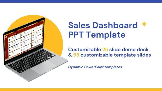
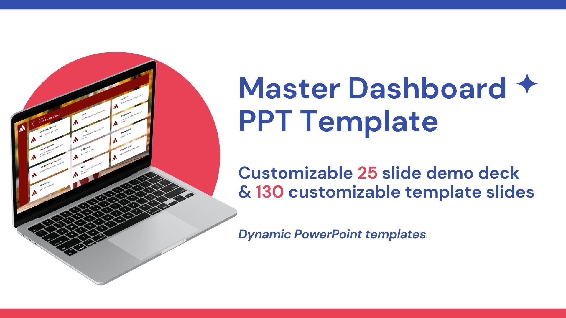
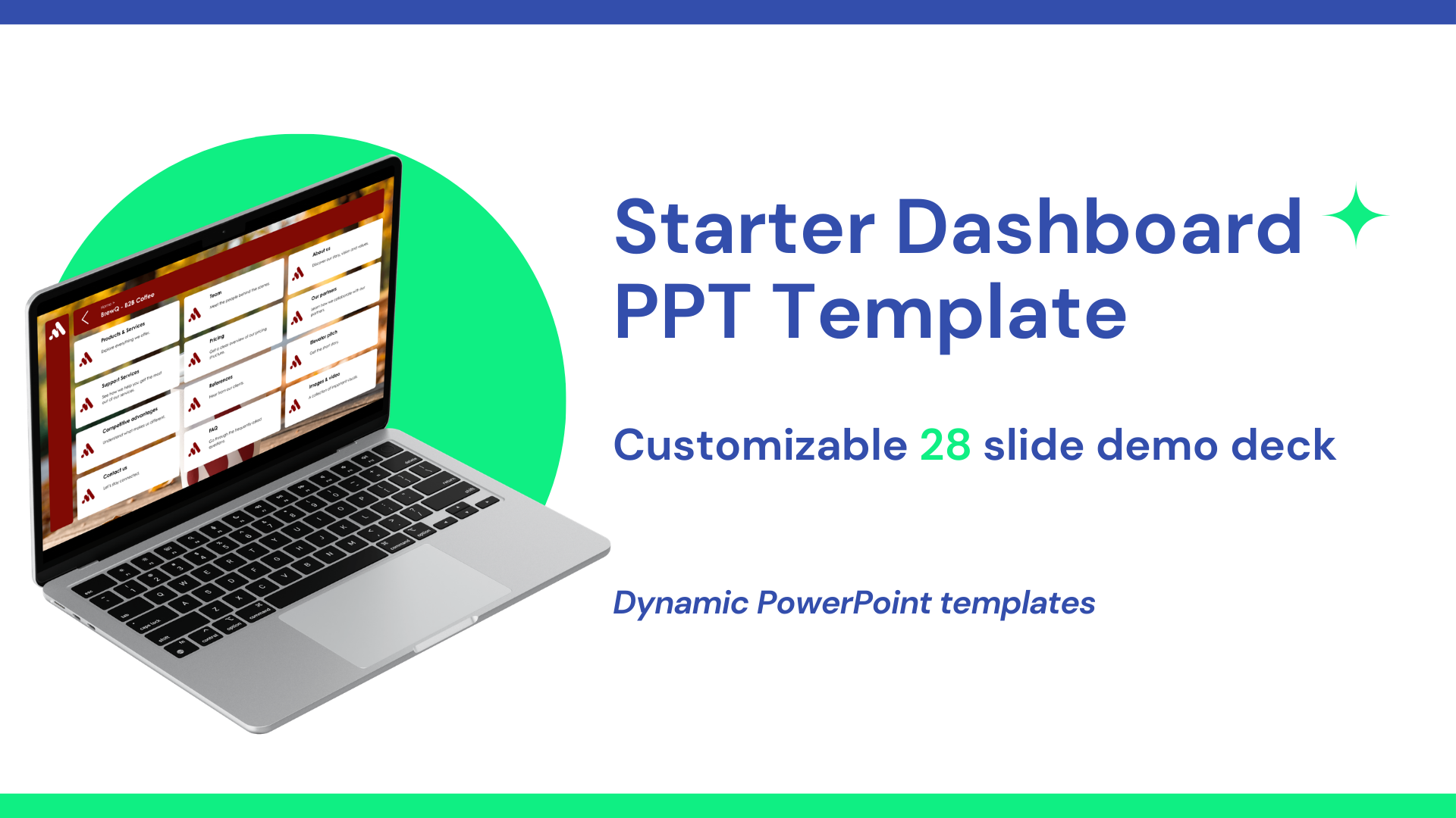
How Tiledekk Enables Dashboard Presentations
At Tiledekk, we’ve built a PowerPoint system specifically for this approach.
Instead of starting from scratch, you get:
-
130+ modular dashboard slides
-
A central navigation system
-
Ready-made sections for common business topics
-
Fully editable PowerPoint files (no special software required)
Each slide is designed as a content module—something you can open, skip, or revisit at any time.
What’s Inside the Tiledekk Dashboard Templates
Tiledekk’s PowerPoint templates are structured around real business conversations, including:
-
Strategy and vision
-
Company and product overviews
-
Market insights
-
Sales and pricing
-
KPIs and metrics
-
Roadmaps and timelines
Because everything is modular, you can:
-
Build custom dashboards per meeting
-
Reuse slides across teams
-
Update content without redesigning layouts
This turns PowerPoint into a living presentation system, not a one-off deck.
Why This Is the #1 Method
Among all the ways to create unique and interactive PowerPoints, the dashboard approach stands out because it:
-
Works live and asynchronously
-
Scales across teams and use cases
-
Supports real dialogue
-
Feels modern without being complicated
It’s not just a design upgrade—it’s a new way of presenting.
2. Scenario-Based PowerPoint (Choose-the-Path Presentations)
Scenario-based PowerPoints are designed around decision points rather than topics.
What Makes This Approach Unique
Instead of presenting information in a fixed order, you:
-
Present options or scenarios
-
Let the audience choose what to explore
-
Jump to different outcomes based on those choices
For example:
-
“What if we increase pricing?”
-
“What happens if we enter this market?”
-
“Which strategy should we prioritize?”
Each option links to a different set of slides.
How It’s Different from Dashboards
While dashboard presentations focus on navigation across topics, scenario-based presentations focus on alternative futures.
They’re especially useful for:
-
Strategy discussions
-
Financial planning
-
Risk analysis
-
Leadership workshops
However, they’re usually narrower in scope than a full dashboard system and less reusable across contexts.
3. Visual-Only PowerPoint (Images Instead of Text)
This approach removes almost all text and relies entirely on visual storytelling.
What Is a Visual-Only Presentation?
A visual-only PowerPoint:
-
Uses images, diagrams, and illustrations
-
Avoids bullet points and paragraphs
-
Supports the speaker instead of replacing them
Each slide communicates a single idea visually, while the explanation comes from the presenter.
Why This Is Truly Different
Unlike dashboards or scenario-based decks, visual-only presentations:
-
Are still linear
-
Rely heavily on live narration
-
Are ineffective without the presenter
They’re ideal for:
-
Keynotes
-
Inspirational talks
-
Vision presentations
But they’re less suitable for detailed business discussions where jumping between topics is required.
Strengths and Limitations
Strengths
-
High emotional impact
-
Clean, modern look
-
Strong storytelling potential
Limitations
-
Not self-explanatory
-
Hard to reuse as a document
-
Less flexible in discussions
This makes visual-only decks powerful—but situational.
4. Interactive Workshop PowerPoint (Fill-In-As-You-Go)
This is one of the most misunderstood—but most effective—ways to use PowerPoint.
What Is an Interactive Workshop PowerPoint?
Unlike traditional presentations, workshop PowerPoints are:
-
Not meant for presentation mode
-
Designed to be filled in live
-
Used as working documents during meetings
Think of them as structured canvases, not slides.
How It Works
Workshop PowerPoint slides might include:
-
Empty frameworks
-
Brainstorm grids
-
Timelines
-
Priority matrices
-
Decision boards
During the session, the facilitator:
-
Types directly into the slides
-
Captures ideas live
-
Co-creates content with the group
The PowerPoint becomes the output of the meeting—not just a visual aid.
Why This Is Different from Dashboards
Dashboards guide conversations.
Workshop PowerPoints capture them.
They’re ideal for:
-
Brainstorming sessions
-
Strategy workshops
-
Team alignment meetings
However, they’re not designed for polished storytelling or sales conversations.
5. Minimalist PowerPoint (One Point per Slide)
Minimalist presentations strip everything down to the essentials.
What Defines a Minimalist PowerPoint?
-
One message per slide
-
Very limited text
-
Strong contrast and whitespace
-
Clear hierarchy
Each slide exists to make one point unmistakably clear.
Why Minimalism Is a Unique Approach
Minimalist decks are not about flexibility or interactivity. They’re about focus.
They work best when:
-
Presenting to executives
-
Communicating key decisions
-
Highlighting critical metrics
Every slide forces clarity—there’s nowhere to hide.
How It Differs from Visual-Only Slides
Visual-only presentations aim for emotion and storytelling.
Minimalist presentations aim for precision and clarity.
They’re often reused as reference material because each slide communicates a standalone insight.
Comparing the 5 Approaches
|
Approach |
Best For |
Key Difference |
|
Dashboard (Tiledekk) |
Sales, strategy, business meetings |
Non-linear, conversation-led |
|
Scenario-based |
Strategy & planning |
Decision-driven paths |
|
Visual-only |
Keynotes & storytelling |
Images replace text |
|
Interactive workshop |
Brainstorms & alignment |
Filled in live |
|
Minimalist |
Executives & decisions |
One point per slide |
FAQs: Unique & Interactive PowerPoints
What makes a PowerPoint interactive?
Interactivity comes from navigation, choice, and participation—not animations. Dashboards, links, and live input all increase interactivity.
Do dashboard PowerPoints still work in PowerPoint?
Yes. Tiledekk dashboards are built entirely in PowerPoint using native features.
Which approach is best for sales?
Dashboard-style presentations are ideal because they adapt to buyer questions in real time.
Are workshop PowerPoints meant to look polished?
No. They’re functional by design. Their value comes from participation, not aesthetics.
Can I combine these approaches?
Yes. Many teams use dashboards as the core system and add minimalist or visual slides where needed.
Where can I find dashboard PowerPoint templates?
You can explore Tiledekk’s dashboard PowerPoint templates at https://www.tiledekk.com
Conclusion: One Tool, Many Ways—But One Clear Winner
There’s no single “correct” way to build a PowerPoint. But there are ways that can give you an edge.
If your goal is to move beyond boring, linear slides and create presentations that feel:
-
Fluid
-
Interactive
-
Conversation-driven
Then the dashboard-style PowerPoint, especially using Tiledekk’s templates, is a strong foundation to start from.
