


Traditional PowerPoint presentations have dominated business, sales, and internal communication for decades. Yet, let’s be honest, most decks are still linear, static, and overloaded with bullet points. In fast-moving meetings, sales conversations, and strategy sessions, this format often feels limiting and outdated.
That’s exactly why standing out, not only in your pitch, but also in the collateral you present, has become so important. Learning how to make a PowerPoint (PPT) dashboard design can be one of those skills.
A PowerPoint dashboard presentation moves away from rigid slide-by-slide storytelling. Instead, it allows you to navigate your content like a dashboard: fluid, flexible, and interactive. You can jump between topics, adapt to your audience, and follow the natural flow of the conversation.
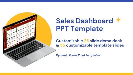
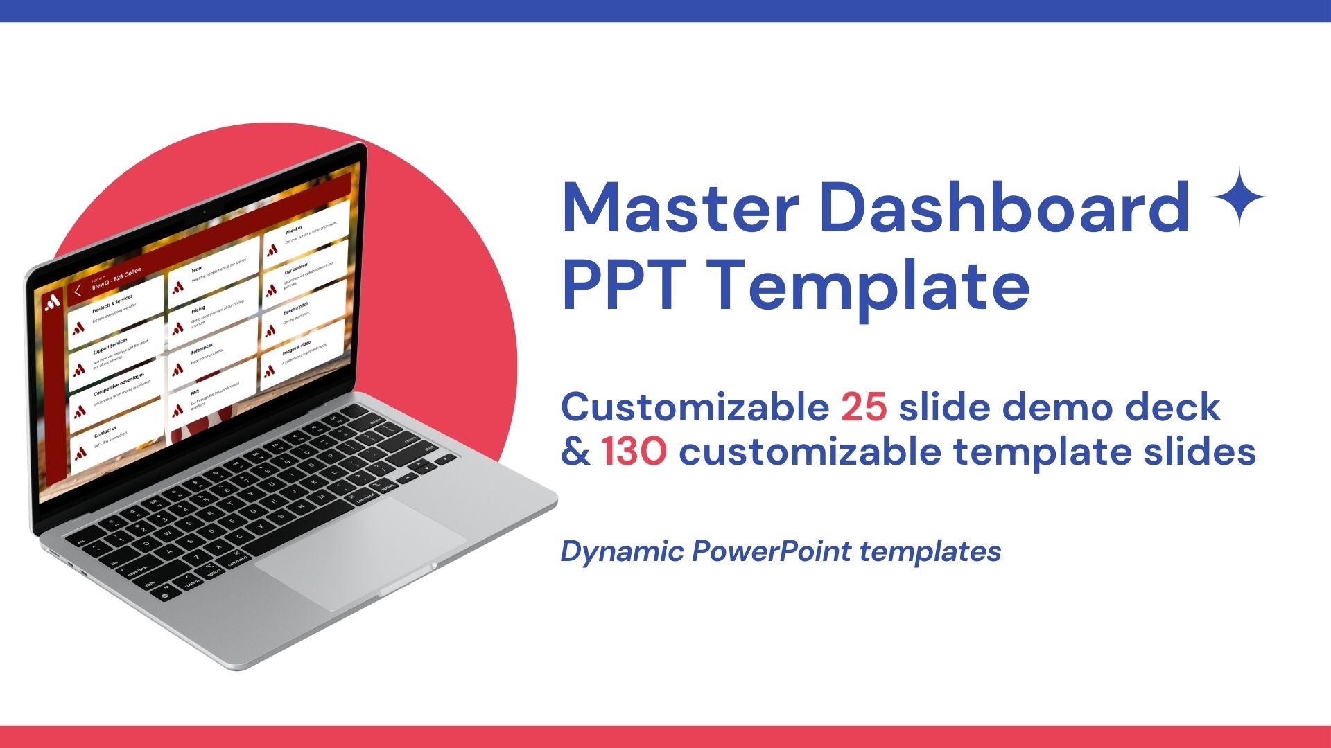
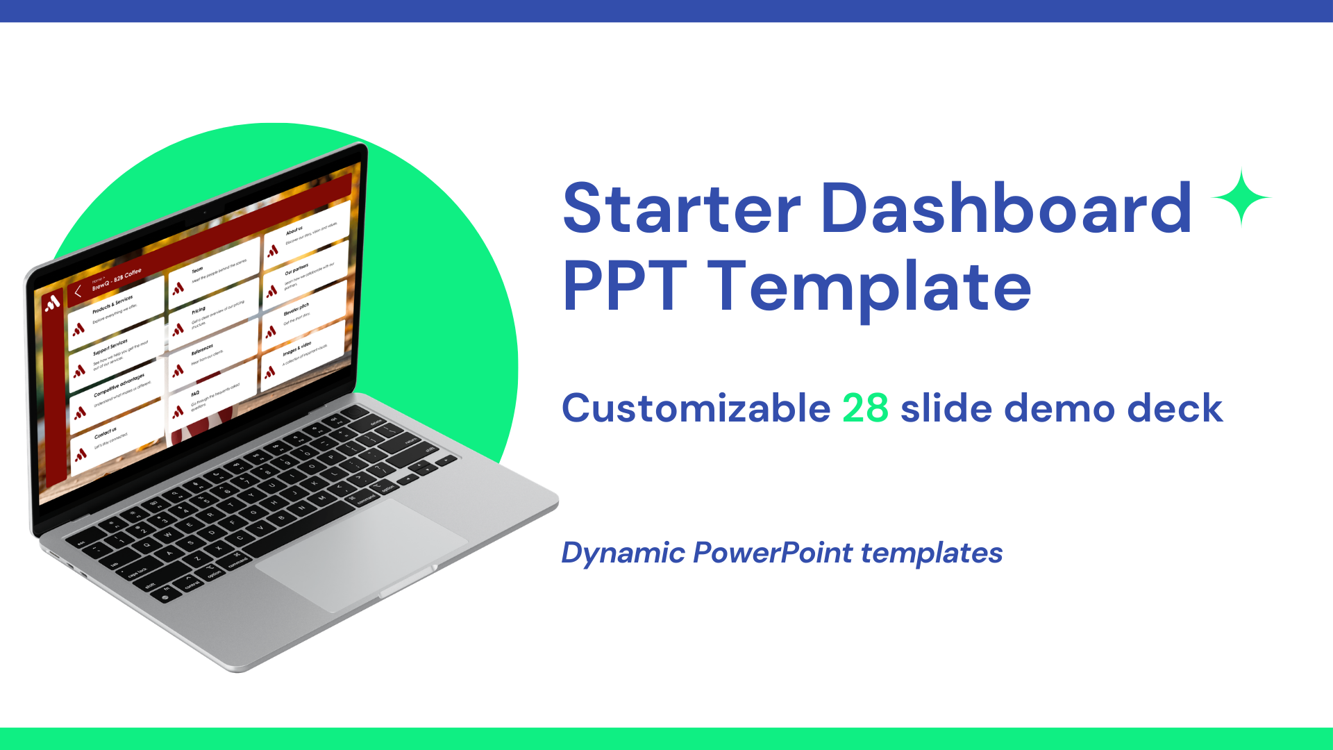
At Tiledekk, we believe PowerPoint should work with you, not against you. That’s why we created a fully modular dashboard PowerPoint template with 150+ slides covering key business topics, so you can build non-linear presentations that feel modern, dynamic, and human.
In this guide, you’ll learn exactly how to design a PowerPoint dashboard, why it works, and how you can use templates to save hours of work while leveling up your presentations.
What is a PowerPoint Dashboard Design?
A PowerPoint dashboard design is a presentation structure built around navigation, modular content, and interactivity rather than a fixed slide order.
Instead of clicking “next” over and over again, a dashboard presentation works like a control panel:
- You start from a main overview slide
- Each section is accessible through clickable tiles or buttons
- You jump to the topic that’s relevant right now
- You return to the dashboard at any time
This approach is especially powerful for:
-
Business presentations
-
Sales decks
-
Strategy sessions
-
Internal meetings
-
Workshops and training
The goal is simple: present what matters, when it matters.
Why traditional PowerPoint no longer works?
Before learning how to make a PowerPoint (PPT) dashboard design, it’s helpful to understand why the old approach often fails.
Linear PowerPoint slides kill flexibility
Traditional decks force you into a predetermined flow. But real conversations don’t work that way. Questions pop up, priorities shift, and audiences want to explore—not be lectured.
You lost the audience before things got spicy
Slide 47 might be important, but not if the audience already checked out at slide 12.
Low Engagement
Static slides with bullet points rarely invite interaction. Dashboards, on the other hand, feel more like a conversation than a presentation.
The dashboard mindset: presentations as conversations
A dashboard presentation is built around one key idea: presentations should adapt to the conversation, not the other way around.
Instead of asking:
“What slide comes next?”
You ask:
“What does my audience need right now?”
This mindset shift is what makes dashboard presentations so powerful—and so effective.
Core Elements of a PowerPoint Dashboard Design
If you want to master how to make a PowerPoint (PPT) dashboard design, these elements are essential.
1. A Central Dashboard Slide
This is your home base. It typically includes:
-
Clear sections (e.g. Strategy, Metrics, Roadmap, Pricing)
-
Clickable tiles or buttons
-
A clean, visual layout
Think of it as the “menu” of your presentation.
2. Modular Content Slides
Each section of your dashboard links to a set of slides that stand on their own. You can:
-
Open them in any order
-
Skip them entirely
-
Dive deep when needed
This modular approach is at the heart of dashboard design.
3. Clear Navigation
Every slide should make it easy to:
-
Go back to the dashboard
-
Jump to another section
-
Stay oriented
Navigation icons, breadcrumbs, or subtle buttons make a big difference.
4. Consistent Visual Language
Colors, typography, icons, and spacing should be consistent across the deck. This helps users feel confident navigating the presentation—even if they jump around.
How to Make a PowerPoint (PPT) Dashboard Design Step by Step
Let’s break the process down into practical steps.
Step 1: Define Your Use Case
Start by asking:
-
Is this for sales, internal reporting, or strategy?
-
Will it be used live, shared asynchronously, or both?
-
Who is the audience?
Dashboard presentations work best when they’re built for real interaction, not just passive viewing.
Step 2: Map Your Content into Sections
Instead of a slide list, think in sections.
For example:
-
Company overview
-
Problem & solution
-
Market insights
-
Product features
-
Pricing
-
Roadmap
Each section becomes a clickable tile on your dashboard.
Step 3: Design the Dashboard Slide
Your dashboard slide should:
-
Be visually clean
-
Clearly label each section
-
Encourage exploration
Avoid clutter. White space can be your friend if you want it to be.
Step 4: Create Non-Linear Links
This is where PowerPoint’s linking features shine.
You can:
-
Link shapes or text to specific slides
-
Create “back to dashboard” buttons
-
Build smooth navigation without animations overload
This transforms PowerPoint into an interactive tool rather than a slideshow.
Step 5: Build Modular Slides
Each slide should:
-
Communicate one idea clearly
-
Work independently
-
Fit visually within the dashboard system
If you remove or reorder slides, nothing should break.
Step 6: Test the Flow
Before presenting:
-
Click through the deck non-linearly
-
Jump between sections
-
Pretend you’re responding to live questions
If it feels intuitive, you’re on the right track.
Design Tips for Better Dashboard PowerPoint Slides
Good dashboard design isn’t just about links—it’s also about clarity and aesthetics.
Keep Text Short
Dashboards work best with:
-
Headlines
-
Keywords
-
Visual summaries
Save long explanations for spoken narration.
Use Visual Hierarchy
Guide the eye using:
-
Size
-
Color
-
Spacing
Important sections should stand out instantly.
Avoid Over-Animation
Subtle transitions are fine. Overuse of animations breaks the dashboard experience and slows you down during live presentations.
Why use templates for Dashboard Presentations
Learning how to make a PowerPoint (PPT) dashboard design from scratch is quite easy, but it’s time-consuming.
That’s where templates come in.
A well-designed dashboard template:
-
Saves hours or days of layout work
-
Ensures visual consistency
-
Gives you proven navigation patterns
-
Lets you focus on content, not formatting
Tiledekk’s Dashboard PowerPoint Template
At Tiledekk, we built our dashboard PowerPoint template specifically to solve the problems of traditional decks.
What Makes Tiledekk Different?
-
150+ ready-to-use slides
-
Modular, non-linear structure
-
Designed for real business conversations
-
Covers key topics like strategy, sales, KPIs, roadmaps, and more
-
Fully editable in PowerPoint
Instead of starting from a blank slide, you start from a dashboard system.
You can explore different sections, adapt your presentation live, and move naturally through your story—without being stuck in slide order.
Use Cases for Dashboard PowerPoint Designs
Dashboard presentations aren’t limited to one scenario. Here’s where they shine.
Sales Presentations
Jump to pricing when asked. Skip features that aren’t relevant. Focus on what matters to the buyer.
Internal Business Updates
Navigate KPIs, initiatives, and roadmaps based on leadership questions.
Workshops & Training
Let participants guide the session. Explore topics as they come up.
Executive Presentations
High-level dashboards with optional deep dives keep meetings efficient.
How Dashboard Presentations Improve Engagement
Dashboard PowerPoint designs:
-
Encourage dialogue
-
Reduce passive listening
-
Make meetings more collaborative
Instead of “presenting at” people, you’re exploring with them.
That’s a powerful shift.
Scaling Your Presentations with a Dashboard System
Once you’ve built (or adopted) a dashboard template:
-
You can reuse it across teams
-
Keep brand consistency
-
Update content without redesigning layouts
This makes PowerPoint a scalable communication tool—not a one-off project.
FAQs: PowerPoint Dashboard Design
What is a dashboard presentation in PowerPoint?
A dashboard presentation uses a central navigation slide and clickable sections to allow non-linear storytelling and interactive navigation.
Is PowerPoint suitable for dashboards?
Yes. With links, shapes, and smart layouts, PowerPoint works surprisingly well for dashboard-style presentations.
Do I need advanced design skills?
Not if you use a professional template. Tools like Tiledekk are designed for business users, not designers.
Can dashboard presentations be shared as files?
Absolutely. They work both live and when shared internally, as long as navigation is clear.
Are dashboard presentations better than traditional decks?
For conversations, meetings, and sales—yes. They’re more flexible and engaging.
Where can I find dashboard PowerPoint templates?
You can explore ready-to-use dashboard templates at Tiledekk, built specifically for non-linear business presentations. Learn more at https://www.tiledekk.com
Conclusion: The Future of PowerPoint Is Non-Linear
Learning how to make a PowerPoint (PPT) dashboard design is more than a design skill, it’s a mindset shift.
Business conversations aren’t linear.
Your presentations shouldn’t be either.
By moving away from boring, basic slides and toward dashboard-style presentations, you:
-
Stay flexible
-
Engage your audience
-
Present with confidence
With tools like Tiledekk’s 130+ slide dashboard PowerPoint template, creating modern, interactive presentations has never been easier.
The future of PowerPoint isn’t more slides, it’s better flow.
